Carousel# Component <neo-carousel> is a scroll-snap carousel over a native <neo-carousel-track> with <neo-carousel-slide> children. Scrolling runs on the compositor via overflow + scroll-snap-type; JS only wires prev / next, keyboard, and active-slide tracking. Add <neo-button data-neo-carousel-prev> / <neo-button data-neo-carousel-next> to opt into arrow controls and the boolean dots attribute to opt into the dot pagination (rendered in the host's shadow root).
The preview routes through the in-browser server simulator. Its current Settings (network latency, a non-200 response, or an unreachable server) are in effect, so the live preview can look like it is misbehaving. Adjust them in the Settings panel.
1
2
3
4
5
HTML CSS
The selected state's markup and its scoped CSS. The CSS is wrapped in <style>@scope { ... }</style> and applies to the preview only. Edits change the preview above, applied live while Sync is on, or when you click Patch or Replace. Patch morphs the preview; Replace swaps it outright.
Signals
Datastar signals
<neo-carousel aria-label="Featured posts" dots class="cx-grid">
<neo-carousel-track>
<neo-carousel-slide value="1" class="cx-slide">1</neo-carousel-slide>
<neo-carousel-slide value="2" class="cx-slide">2</neo-carousel-slide>
<neo-carousel-slide value="3" class="cx-slide">3</neo-carousel-slide>
<neo-carousel-slide value="4" class="cx-slide">4</neo-carousel-slide>
<neo-carousel-slide value="5" class="cx-slide">5</neo-carousel-slide>
</neo-carousel-track>
<neo-button class="cx-nav" aria-label="Previous slide" data-neo-carousel-prev>
<neo-icon name="chevron-left"></neo-icon>
</neo-button>
<neo-button class="cx-nav" aria-label="Next slide" data-neo-carousel-next>
<neo-icon name="chevron-right"></neo-icon>
</neo-button>
</neo-carousel> .cx-grid {
display: grid;
width: 100%;
height: 100%;
grid-template-columns: minmax(0, 1fr);
grid-template-rows: 1fr auto;
grid-template-areas: "slides" "controls";
}
.cx-grid > neo-carousel-track,
.cx-grid > .cx-nav,
.cx-grid::part(dots) { grid-area: slides; }
.cx-grid::part(dots) {
align-self: end;
justify-self: center;
margin-bottom: 0.5rem;
padding: 0;
z-index: 1;
pointer-events: auto;
}
.cx-grid > .cx-nav {
align-self: center;
z-index: 1;
width: 2.25rem;
height: 2.25rem;
padding: 0;
display: inline-flex;
align-items: center;
justify-content: center;
border-radius: 999px;
background: color-mix(in srgb, var(--page-bg) 88%, transparent);
box-shadow: 0 1px 3px rgba(0, 0, 0, 0.18);
}
.cx-grid > [data-neo-carousel-prev].cx-nav { justify-self: start; margin-left: 0.5rem; }
.cx-grid > [data-neo-carousel-next].cx-nav { justify-self: end; margin-right: 0.5rem; }
.cx-slide {
display: flex;
align-items: center;
justify-content: center;
height: 100%;
background: var(--btn-bg);
border: 1px solid var(--btn-border);
border-radius: var(--page-radius, 0.5rem);
font-weight: 600;
}
<neo-carousel
  per-view="3"
  spacing="0.75rem"
  aria-label="Slides"
  class="cx-grid"
>
  <neo-carousel-track>
    <neo-carousel-slide value="1" class="cx-slide">1</neo-carousel-slide>
    <neo-carousel-slide value="2" class="cx-slide">2</neo-carousel-slide>
    <neo-carousel-slide value="3" class="cx-slide">3</neo-carousel-slide>
    <neo-carousel-slide value="4" class="cx-slide">4</neo-carousel-slide>
    <neo-carousel-slide value="5" class="cx-slide">5</neo-carousel-slide>
    <neo-carousel-slide value="6" class="cx-slide">6</neo-carousel-slide>
  </neo-carousel-track>
  <neo-button class="cx-nav" aria-label="Previous slide" data-neo-carousel-prev>
    <neo-icon name="chevron-left"></neo-icon>
  </neo-button>
  <neo-button class="cx-nav" aria-label="Next slide" data-neo-carousel-next>
    <neo-icon name="chevron-right"></neo-icon>
  </neo-button>
</neo-carousel> .cx-grid {
display: grid;
width: 100%;
height: 100%;
grid-template-columns: minmax(0, 1fr);
grid-template-rows: 1fr auto;
grid-template-areas: "slides" "controls";
}
.cx-grid > neo-carousel-track,
.cx-grid > .cx-nav,
.cx-grid::part(dots) { grid-area: slides; }
.cx-grid::part(dots) {
align-self: end;
justify-self: center;
margin-bottom: 0.5rem;
padding: 0;
z-index: 1;
pointer-events: auto;
}
.cx-grid > .cx-nav {
align-self: center;
z-index: 1;
width: 2.25rem;
height: 2.25rem;
padding: 0;
display: inline-flex;
align-items: center;
justify-content: center;
border-radius: 999px;
background: color-mix(in srgb, var(--page-bg) 88%, transparent);
box-shadow: 0 1px 3px rgba(0, 0, 0, 0.18);
}
.cx-grid > [data-neo-carousel-prev].cx-nav { justify-self: start; margin-left: 0.5rem; }
.cx-grid > [data-neo-carousel-next].cx-nav { justify-self: end; margin-right: 0.5rem; }
.cx-slide {
display: flex;
align-items: center;
justify-content: center;
height: 100%;
background: var(--btn-bg);
border: 1px solid var(--btn-border);
border-radius: var(--page-radius, 0.5rem);
font-weight: 600;
}
<neo-carousel
  align="end"
  per-view="auto"
  spacing="0.75rem"
  aria-label="Slides"
  class="cx-grid"
>
  <neo-carousel-track>
    <neo-carousel-slide
      value="xxl"
      style="display:flex;align-items:center;justify-content:center;height:100%;width:26rem;background:var(--btn-bg);border:1px solid var(--btn-border);border-radius:var(--page-radius, 0.5rem);font-weight:600;"
    >XXL</neo-carousel-slide>
    <neo-carousel-slide
      value="xl"
      style="display:flex;align-items:center;justify-content:center;height:100%;width:20rem;background:var(--btn-bg);border:1px solid var(--btn-border);border-radius:var(--page-radius, 0.5rem);font-weight:600;"
    >XL</neo-carousel-slide>
    <neo-carousel-slide
      value="l"
      style="display:flex;align-items:center;justify-content:center;height:100%;width:16rem;background:var(--btn-bg);border:1px solid var(--btn-border);border-radius:var(--page-radius, 0.5rem);font-weight:600;"
    >L</neo-carousel-slide>
    <neo-carousel-slide
      value="m"
      style="display:flex;align-items:center;justify-content:center;height:100%;width:12rem;background:var(--btn-bg);border:1px solid var(--btn-border);border-radius:var(--page-radius, 0.5rem);font-weight:600;"
    >M</neo-carousel-slide>
    <neo-carousel-slide
      value="s"
      style="display:flex;align-items:center;justify-content:center;height:100%;width:8rem;background:var(--btn-bg);border:1px solid var(--btn-border);border-radius:var(--page-radius, 0.5rem);font-weight:600;"
    >S</neo-carousel-slide>
    <neo-carousel-slide
      value="xs"
      style="display:flex;align-items:center;justify-content:center;height:100%;width:5rem;background:var(--btn-bg);border:1px solid var(--btn-border);border-radius:var(--page-radius, 0.5rem);font-weight:600;"
    >XS</neo-carousel-slide>
  </neo-carousel-track>
  <neo-button class="cx-nav" aria-label="Previous slide" data-neo-carousel-prev>
    <neo-icon name="chevron-left"></neo-icon>
  </neo-button>
  <neo-button class="cx-nav" aria-label="Next slide" data-neo-carousel-next>
    <neo-icon name="chevron-right"></neo-icon>
  </neo-button>
</neo-carousel> .cx-grid {
display: grid;
width: 100%;
height: 100%;
grid-template-columns: minmax(0, 1fr);
grid-template-rows: 1fr auto;
grid-template-areas: "slides" "controls";
}
.cx-grid > neo-carousel-track,
.cx-grid > .cx-nav,
.cx-grid::part(dots) { grid-area: slides; }
.cx-grid::part(dots) {
align-self: end;
justify-self: center;
margin-bottom: 0.5rem;
padding: 0;
z-index: 1;
pointer-events: auto;
}
.cx-grid > .cx-nav {
align-self: center;
z-index: 1;
width: 2.25rem;
height: 2.25rem;
padding: 0;
display: inline-flex;
align-items: center;
justify-content: center;
border-radius: 999px;
background: color-mix(in srgb, var(--page-bg) 88%, transparent);
box-shadow: 0 1px 3px rgba(0, 0, 0, 0.18);
}
.cx-grid > [data-neo-carousel-prev].cx-nav { justify-self: start; margin-left: 0.5rem; }
.cx-grid > [data-neo-carousel-next].cx-nav { justify-self: end; margin-right: 0.5rem; }
<neo-carousel
  per-view="3"
  spacing="0.75rem"
  aria-label="Slides"
  dots
  class="cx-bars"
>
  <neo-carousel-track>
    <neo-carousel-slide value="1" class="cx-slide">1</neo-carousel-slide>
    <neo-carousel-slide value="2" class="cx-slide">2</neo-carousel-slide>
    <neo-carousel-slide value="3" class="cx-slide">3</neo-carousel-slide>
    <neo-carousel-slide value="4" class="cx-slide">4</neo-carousel-slide>
    <neo-carousel-slide value="5" class="cx-slide">5</neo-carousel-slide>
    <neo-carousel-slide value="6" class="cx-slide">6</neo-carousel-slide>
    <neo-carousel-slide value="7" class="cx-slide">7</neo-carousel-slide>
    <neo-carousel-slide value="8" class="cx-slide">8</neo-carousel-slide>
  </neo-carousel-track>
</neo-carousel> .cx-bars { width: 100%; height: 100%; }
.cx-bars::part(dots) { gap: 0.25rem; align-items: flex-end; }
.cx-bars::part(dot) {
width: 2rem;
height: 0.75rem;
border-radius: 0;
background: transparent;
transform: none;
display: flex;
align-items: flex-end;
}
.cx-bars::part(dot)::before {
content: "";
display: block;
width: 100%;
height: 0.25rem;
background: var(--neo-carousel-dot-bg);
transition:
height 200ms var(--neo-easing, ease-out),
background-color 200ms var(--neo-easing, ease-out);
}
.cx-bars::part(dot-partial)::before {
height: 0.5rem;
background: color-mix(in srgb, var(--accent) 55%, var(--neo-carousel-dot-bg));
}
.cx-bars::part(dot-full)::before { height: 0.75rem; background: var(--accent); }
.cx-bars::part(dot):hover::before {
height: 0.75rem;
background: color-mix(in srgb, var(--accent) 70%, var(--neo-carousel-dot-bg));
}
.cx-bars::part(dot-full):hover::before { background: var(--accent); }
.cx-slide {
display: flex;
align-items: center;
justify-content: center;
height: 100%;
background: var(--btn-bg);
border: 1px solid var(--btn-border);
border-radius: var(--page-radius, 0.5rem);
font-weight: 600;
}
<neo-carousel loop autoplay="3000" aria-label="Slides" dots class="cx-pill">
  <neo-carousel-track>
    <neo-carousel-slide value="1" class="cx-slide">First</neo-carousel-slide>
    <neo-carousel-slide value="2" class="cx-slide">Second</neo-carousel-slide>
    <neo-carousel-slide value="3" class="cx-slide">Third</neo-carousel-slide>
  </neo-carousel-track>
  <neo-layout align-items="center" class="cx-controls">
    <neo-button aria-label="Pause / resume autoplay" data-neo-carousel-pause>
      <span data-neo-carousel-when-playing class="cx-pause-label">
        <neo-icon name="pause"></neo-icon>
        <span>Pause</span>
      </span>
      <span data-neo-carousel-when-paused class="cx-pause-label">
        <neo-icon name="play"></neo-icon>
        <span>Play</span>
      </span>
    </neo-button>
  </neo-layout>
</neo-carousel> .cx-pill {
display: grid;
width: 100%;
height: 100%;
grid-template-columns: minmax(0, 1fr);
grid-template-rows: 1fr auto;
grid-template-areas: "slides" "controls";
}
.cx-pill > neo-carousel-track,
.cx-pill > .cx-nav,
.cx-pill::part(dots) { grid-area: slides; }
.cx-pill::part(dots) {
align-self: end;
justify-self: center;
margin-bottom: 0.5rem;
padding: 0;
z-index: 1;
pointer-events: auto;
}
.cx-pill > .cx-nav {
align-self: center;
z-index: 1;
width: 2.25rem;
height: 2.25rem;
padding: 0;
display: inline-flex;
align-items: center;
justify-content: center;
border-radius: 999px;
background: color-mix(in srgb, var(--page-bg) 88%, transparent);
box-shadow: 0 1px 3px rgba(0, 0, 0, 0.18);
}
.cx-pill > [data-neo-carousel-prev].cx-nav { justify-self: start; margin-left: 0.5rem; }
.cx-pill > [data-neo-carousel-next].cx-nav { justify-self: end; margin-right: 0.5rem; }
.cx-pill > .cx-controls {
grid-area: controls;
display: flex;
align-items: center;
gap: 0.75rem;
margin-top: 0.6rem;
}
.cx-pause-label { display: inline-flex; align-items: center; gap: 0.4rem; }
.cx-slide {
display: flex;
align-items: center;
justify-content: center;
height: 100%;
background: var(--btn-bg);
border: 1px solid var(--btn-border);
border-radius: var(--page-radius, 0.5rem);
font-weight: 600;
}
<neo-carousel
  per-view="1"
  spacing="0.75rem"
  aria-label="Slides"
  easing="1100ms linear(0, 0.076 10%, 0.303 20%, 0.681 30%, 1 36.4%, 0.91 40%, 0.82 45%, 0.75 54.5%, 0.83 65%, 1 72.7%, 0.97 75%, 0.94 81.8%, 1 90.9%, 0.98 95%, 1)"
  highlight-active
  dots
  class="cx-grid"
>
  <neo-carousel-track>
    <neo-carousel-slide value="1" class="cx-slide">1</neo-carousel-slide>
    <neo-carousel-slide value="2" class="cx-slide">2</neo-carousel-slide>
    <neo-carousel-slide value="3" class="cx-slide">3</neo-carousel-slide>
    <neo-carousel-slide value="4" class="cx-slide">4</neo-carousel-slide>
  </neo-carousel-track>
  <neo-button class="cx-nav" aria-label="Previous slide" data-neo-carousel-prev>
    <neo-icon name="chevron-left"></neo-icon>
  </neo-button>
  <neo-button class="cx-nav" aria-label="Next slide" data-neo-carousel-next>
    <neo-icon name="chevron-right"></neo-icon>
  </neo-button>
</neo-carousel> .cx-grid {
display: grid;
width: 100%;
height: 100%;
grid-template-columns: minmax(0, 1fr);
grid-template-rows: 1fr auto;
grid-template-areas: "slides" "controls";
}
.cx-grid > neo-carousel-track,
.cx-grid > .cx-nav,
.cx-grid::part(dots) { grid-area: slides; }
.cx-grid::part(dots) {
align-self: end;
justify-self: center;
margin-bottom: 0.5rem;
padding: 0;
z-index: 1;
pointer-events: auto;
}
.cx-grid > .cx-nav {
align-self: center;
z-index: 1;
width: 2.25rem;
height: 2.25rem;
padding: 0;
display: inline-flex;
align-items: center;
justify-content: center;
border-radius: 999px;
background: color-mix(in srgb, var(--page-bg) 88%, transparent);
box-shadow: 0 1px 3px rgba(0, 0, 0, 0.18);
}
.cx-grid > [data-neo-carousel-prev].cx-nav { justify-self: start; margin-left: 0.5rem; }
.cx-grid > [data-neo-carousel-next].cx-nav { justify-self: end; margin-right: 0.5rem; }
.cx-slide {
display: flex;
align-items: center;
justify-content: center;
height: 100%;
background: var(--btn-bg);
border: 1px solid var(--btn-border);
border-radius: var(--page-radius, 0.5rem);
font-weight: 600;
}
<neo-carousel
  orientation="vertical"
  aria-label="Slides"
  drag-nav
  dots
  class="cx-vert"
>
  <neo-carousel-track>
    <neo-carousel-slide value="1" class="cx-slide">Top</neo-carousel-slide>
    <neo-carousel-slide value="2" class="cx-slide">Middle</neo-carousel-slide>
    <neo-carousel-slide value="3" class="cx-slide">Bottom</neo-carousel-slide>
  </neo-carousel-track>
</neo-carousel> .cx-vert { width: 100%; height: 100%; }
.cx-vert::part(dots) {
position: absolute;
top: 0;
bottom: 0;
right: 0.5rem;
flex-direction: column;
padding: 0;
z-index: 1;
}
.cx-slide {
display: flex;
align-items: center;
justify-content: center;
height: 100%;
background: var(--btn-bg);
border: 1px solid var(--btn-border);
border-radius: var(--page-radius, 0.5rem);
font-weight: 600;
}
<neo-carousel touch="false" aria-label="Slides" class="cx-edge">
  <neo-carousel-track tabindex="-1">
    <neo-carousel-slide value="1" class="cx-slide">1</neo-carousel-slide>
    <neo-carousel-slide value="2" class="cx-slide">2</neo-carousel-slide>
    <neo-carousel-slide value="3" class="cx-slide">3</neo-carousel-slide>
  </neo-carousel-track>
  <neo-button
    aria-label="Previous slide"
    class="cx-edge-btn cx-edge-prev"
    data-neo-carousel-prev
  >
    <neo-icon name="chevron-left"></neo-icon>
  </neo-button>
  <neo-button
    aria-label="Next slide"
    class="cx-edge-btn cx-edge-next"
    data-neo-carousel-next
  >
    <neo-icon name="chevron-right"></neo-icon>
  </neo-button>
</neo-carousel> .cx-edge { width: 100%; height: 100%; }
.cx-edge-btn {
position: absolute;
/* Auto-margin centering, not translateY(-50%): neo-button owns its
* transform for hover/active lift and wins the cascade. */
top: 0;
bottom: 0;
margin-block: auto;
z-index: 1;
width: 2.25rem;
height: 2.25rem;
padding: 0;
display: inline-flex;
align-items: center;
justify-content: center;
border-radius: 999px;
background: color-mix(in srgb, var(--page-bg) 88%, transparent);
box-shadow: 0 1px 3px rgba(0, 0, 0, 0.18);
}
.cx-edge-prev { left: 0.5rem; }
.cx-edge-next { right: 0.5rem; }
.cx-slide {
display: flex;
align-items: center;
justify-content: center;
height: 100%;
background: var(--btn-bg);
border: 1px solid var(--btn-border);
border-radius: var(--page-radius, 0.5rem);
font-weight: 600;
}
<neo-carousel per-view="5" spacing="0.5rem" aria-label="Slides" class="cx-grid">
  <neo-carousel-track>
    <neo-carousel-slide value="1" class="cx-slide">1</neo-carousel-slide>
    <neo-carousel-slide value="2" class="cx-slide">2</neo-carousel-slide>
    <neo-carousel-slide value="3" class="cx-slide">3</neo-carousel-slide>
    <neo-carousel-slide value="4" class="cx-slide">4</neo-carousel-slide>
    <neo-carousel-slide value="5" class="cx-slide">5</neo-carousel-slide>
    <neo-carousel-slide value="6" class="cx-slide">6</neo-carousel-slide>
    <neo-carousel-slide value="7" class="cx-slide">7</neo-carousel-slide>
    <neo-carousel-slide value="8" class="cx-slide">8</neo-carousel-slide>
    <neo-carousel-slide value="9" class="cx-slide">9</neo-carousel-slide>
    <neo-carousel-slide value="10" class="cx-slide">10</neo-carousel-slide>
    <neo-carousel-slide value="11" class="cx-slide">11</neo-carousel-slide>
    <neo-carousel-slide value="12" class="cx-slide">12</neo-carousel-slide>
    <neo-carousel-slide value="13" class="cx-slide">13</neo-carousel-slide>
    <neo-carousel-slide value="14" class="cx-slide">14</neo-carousel-slide>
    <neo-carousel-slide value="15" class="cx-slide">15</neo-carousel-slide>
    <neo-carousel-slide value="16" class="cx-slide">16</neo-carousel-slide>
    <neo-carousel-slide value="17" class="cx-slide">17</neo-carousel-slide>
    <neo-carousel-slide value="18" class="cx-slide">18</neo-carousel-slide>
    <neo-carousel-slide value="19" class="cx-slide">19</neo-carousel-slide>
    <neo-carousel-slide value="20" class="cx-slide">20</neo-carousel-slide>
    <neo-carousel-slide value="21" class="cx-slide">21</neo-carousel-slide>
    <neo-carousel-slide value="22" class="cx-slide">22</neo-carousel-slide>
    <neo-carousel-slide value="23" class="cx-slide">23</neo-carousel-slide>
    <neo-carousel-slide value="24" class="cx-slide">24</neo-carousel-slide>
    <neo-carousel-slide value="25" class="cx-slide">25</neo-carousel-slide>
    <neo-carousel-slide value="26" class="cx-slide">26</neo-carousel-slide>
    <neo-carousel-slide value="27" class="cx-slide">27</neo-carousel-slide>
    <neo-carousel-slide value="28" class="cx-slide">28</neo-carousel-slide>
    <neo-carousel-slide value="29" class="cx-slide">29</neo-carousel-slide>
    <neo-carousel-slide value="30" class="cx-slide">30</neo-carousel-slide>
    <neo-carousel-slide value="31" class="cx-slide">31</neo-carousel-slide>
    <neo-carousel-slide value="32" class="cx-slide">32</neo-carousel-slide>
    <neo-carousel-slide value="33" class="cx-slide">33</neo-carousel-slide>
    <neo-carousel-slide value="34" class="cx-slide">34</neo-carousel-slide>
    <neo-carousel-slide value="35" class="cx-slide">35</neo-carousel-slide>
    <neo-carousel-slide value="36" class="cx-slide">36</neo-carousel-slide>
    <neo-carousel-slide value="37" class="cx-slide">37</neo-carousel-slide>
    <neo-carousel-slide value="38" class="cx-slide">38</neo-carousel-slide>
    <neo-carousel-slide value="39" class="cx-slide">39</neo-carousel-slide>
    <neo-carousel-slide value="40" class="cx-slide">40</neo-carousel-slide>
    <neo-carousel-slide value="41" class="cx-slide">41</neo-carousel-slide>
    <neo-carousel-slide value="42" class="cx-slide">42</neo-carousel-slide>
    <neo-carousel-slide value="43" class="cx-slide">43</neo-carousel-slide>
    <neo-carousel-slide value="44" class="cx-slide">44</neo-carousel-slide>
    <neo-carousel-slide value="45" class="cx-slide">45</neo-carousel-slide>
    <neo-carousel-slide value="46" class="cx-slide">46</neo-carousel-slide>
    <neo-carousel-slide value="47" class="cx-slide">47</neo-carousel-slide>
    <neo-carousel-slide value="48" class="cx-slide">48</neo-carousel-slide>
    <neo-carousel-slide value="49" class="cx-slide">49</neo-carousel-slide>
    <neo-carousel-slide value="50" class="cx-slide">50</neo-carousel-slide>
    <neo-carousel-slide value="51" class="cx-slide">51</neo-carousel-slide>
    <neo-carousel-slide value="52" class="cx-slide">52</neo-carousel-slide>
    <neo-carousel-slide value="53" class="cx-slide">53</neo-carousel-slide>
    <neo-carousel-slide value="54" class="cx-slide">54</neo-carousel-slide>
    <neo-carousel-slide value="55" class="cx-slide">55</neo-carousel-slide>
    <neo-carousel-slide value="56" class="cx-slide">56</neo-carousel-slide>
    <neo-carousel-slide value="57" class="cx-slide">57</neo-carousel-slide>
    <neo-carousel-slide value="58" class="cx-slide">58</neo-carousel-slide>
    <neo-carousel-slide value="59" class="cx-slide">59</neo-carousel-slide>
    <neo-carousel-slide value="60" class="cx-slide">60</neo-carousel-slide>
    <neo-carousel-slide value="61" class="cx-slide">61</neo-carousel-slide>
    <neo-carousel-slide value="62" class="cx-slide">62</neo-carousel-slide>
    <neo-carousel-slide value="63" class="cx-slide">63</neo-carousel-slide>
    <neo-carousel-slide value="64" class="cx-slide">64</neo-carousel-slide>
    <neo-carousel-slide value="65" class="cx-slide">65</neo-carousel-slide>
    <neo-carousel-slide value="66" class="cx-slide">66</neo-carousel-slide>
    <neo-carousel-slide value="67" class="cx-slide">67</neo-carousel-slide>
    <neo-carousel-slide value="68" class="cx-slide">68</neo-carousel-slide>
    <neo-carousel-slide value="69" class="cx-slide">69</neo-carousel-slide>
    <neo-carousel-slide value="70" class="cx-slide">70</neo-carousel-slide>
    <neo-carousel-slide value="71" class="cx-slide">71</neo-carousel-slide>
    <neo-carousel-slide value="72" class="cx-slide">72</neo-carousel-slide>
    <neo-carousel-slide value="73" class="cx-slide">73</neo-carousel-slide>
    <neo-carousel-slide value="74" class="cx-slide">74</neo-carousel-slide>
    <neo-carousel-slide value="75" class="cx-slide">75</neo-carousel-slide>
    <neo-carousel-slide value="76" class="cx-slide">76</neo-carousel-slide>
    <neo-carousel-slide value="77" class="cx-slide">77</neo-carousel-slide>
    <neo-carousel-slide value="78" class="cx-slide">78</neo-carousel-slide>
    <neo-carousel-slide value="79" class="cx-slide">79</neo-carousel-slide>
    <neo-carousel-slide value="80" class="cx-slide">80</neo-carousel-slide>
    <neo-carousel-slide value="81" class="cx-slide">81</neo-carousel-slide>
    <neo-carousel-slide value="82" class="cx-slide">82</neo-carousel-slide>
    <neo-carousel-slide value="83" class="cx-slide">83</neo-carousel-slide>
    <neo-carousel-slide value="84" class="cx-slide">84</neo-carousel-slide>
    <neo-carousel-slide value="85" class="cx-slide">85</neo-carousel-slide>
    <neo-carousel-slide value="86" class="cx-slide">86</neo-carousel-slide>
    <neo-carousel-slide value="87" class="cx-slide">87</neo-carousel-slide>
    <neo-carousel-slide value="88" class="cx-slide">88</neo-carousel-slide>
    <neo-carousel-slide value="89" class="cx-slide">89</neo-carousel-slide>
    <neo-carousel-slide value="90" class="cx-slide">90</neo-carousel-slide>
    <neo-carousel-slide value="91" class="cx-slide">91</neo-carousel-slide>
    <neo-carousel-slide value="92" class="cx-slide">92</neo-carousel-slide>
    <neo-carousel-slide value="93" class="cx-slide">93</neo-carousel-slide>
    <neo-carousel-slide value="94" class="cx-slide">94</neo-carousel-slide>
    <neo-carousel-slide value="95" class="cx-slide">95</neo-carousel-slide>
    <neo-carousel-slide value="96" class="cx-slide">96</neo-carousel-slide>
    <neo-carousel-slide value="97" class="cx-slide">97</neo-carousel-slide>
    <neo-carousel-slide value="98" class="cx-slide">98</neo-carousel-slide>
    <neo-carousel-slide value="99" class="cx-slide">99</neo-carousel-slide>
    <neo-carousel-slide value="100" class="cx-slide">100</neo-carousel-slide>
  </neo-carousel-track>
  <neo-button class="cx-nav" aria-label="Previous slide" data-neo-carousel-prev>
    <neo-icon name="chevron-left"></neo-icon>
  </neo-button>
  <neo-button class="cx-nav" aria-label="Next slide" data-neo-carousel-next>
    <neo-icon name="chevron-right"></neo-icon>
  </neo-button>
</neo-carousel> .cx-grid {
display: grid;
width: 100%;
height: 100%;
grid-template-columns: minmax(0, 1fr);
grid-template-rows: 1fr auto;
grid-template-areas: "slides" "controls";
}
.cx-grid > neo-carousel-track,
.cx-grid > .cx-nav,
.cx-grid::part(dots) { grid-area: slides; }
.cx-grid::part(dots) {
align-self: end;
justify-self: center;
margin-bottom: 0.5rem;
padding: 0;
z-index: 1;
pointer-events: auto;
}
.cx-grid > .cx-nav {
align-self: center;
z-index: 1;
width: 2.25rem;
height: 2.25rem;
padding: 0;
display: inline-flex;
align-items: center;
justify-content: center;
border-radius: 999px;
background: color-mix(in srgb, var(--page-bg) 88%, transparent);
box-shadow: 0 1px 3px rgba(0, 0, 0, 0.18);
}
.cx-grid > [data-neo-carousel-prev].cx-nav { justify-self: start; margin-left: 0.5rem; }
.cx-grid > [data-neo-carousel-next].cx-nav { justify-self: end; margin-right: 0.5rem; }
.cx-slide {
display: flex;
align-items: center;
justify-content: center;
height: 100%;
background: var(--btn-bg);
border: 1px solid var(--btn-border);
border-radius: var(--page-radius, 0.5rem);
font-weight: 600;
}
Reference# # Name Type Default Description valuestringnone Active slide value. Falls back to the first slide when unset. An external patch sets the slide instantly (jump); a fat morph that drops it is no command, so the current slide stays. The carousel's own navigation always animates. orientation"horizontal" | "vertical"horizontalLayout axis. Vertical mode uses y-axis scrolling and up / down arrow keys. per-viewnumber | "auto"1Visible slides per view. Use auto to keep each slide's intrinsic size. spacinglengthnone Gap between slides; accepts any CSS length. align"start" | "center" | "end"startWhere the active slide snaps inside the viewport. loopbooleanfalseWrap prev / next and autoplay past the ends. touchtrue | falsetrueNative gesture scrolling. Set touch="false" to disable it; buttons and keyboard navigation still work. autoplaynumber (ms)none Milliseconds between automatic advances. Unset disables autoplay; use paused or a data-neo-carousel-pause button to suspend. autoplay-stepnumber1Slides advanced per autoplay tick. Only applies when per-view is greater than 1. pausedbooleanfalseSuspends autoplay without removing the interval. Toggled by data-neo-carousel-pause buttons and by Space while the host is focused. aria-labelstringnone Accessible name for the carousel region. easingstringnone Timing for programmatic scrolls. Use a duration ("600ms") or duration plus timing function. Falls back to theme --neo-easing and respects reduced motion. animate-patchbooleanfalseAnimate external value patches (using easing) instead of jumping. Read per patch: set it alongside value to glide one transition, omit it to jump the next. highlight-activebooleanfalseOpt-in visibility styling. Off-screen slides dim to --neo-carousel-slide-inactive-opacity and visible slides remain opaque. The kit also writes data-neo-carousel-slide-visibility for custom styling. click-navbooleanfalseClick a slide to activate it. Interactive content inside slides keeps its normal click behavior. drag-navbooleanfalseMouse / pen drag scrolls the track. Touch keeps native scrolling; ignored when touch="false". auto-activatebooleanfalseArrow keys on a focused dot also commit the slide during the focus move (mirrors neo-tabs). Without it, arrow keys are focus-only and Enter / Space commits. dotsbooleanfalseRenders the dot tablist in the host's shadow root. Position / style via ::part(dots) and ::part(dot); customize per-dot inner markup with <template data-neo-carousel-dot>. stepnumbernone Slides advanced per prev / next / arrow press. Defaults to per-view so each press exposes a whole new visible group; set to 1 (or any N) for finer stepping.
# Name Description default Track, slides, and optional navigation controls. <template data-neo-carousel-dot>Optional. Cloned into each dot button for custom inner markup; the kit still owns the button styling (focus, aria-current, data-neo-carousel-dot-visibility). [data-neo-carousel-prev]Previous-slide trigger. [data-neo-carousel-next]Next-slide trigger. [data-neo-carousel-pause]Toggles paused; mirrors state via aria-pressed and disables when autoplay is unset. [data-neo-carousel-when-playing]Child of [data-neo-carousel-pause] shown while playing (button not pressed); the kit hides it when paused. [data-neo-carousel-when-paused]Child of [data-neo-carousel-pause] shown while paused (button pressed); the kit hides it while playing.
# Name Detail Bubbles Description neo-carousel-change{ value: string, index: number }yes Fires after the active slide changes. index is zero-based.
# Name Description ::part(dots)Dot tablist container in the shadow root. Position and lay it out from the page. ::part(dot)Each dot button. ::part(dot-partial)Added to a dot whose slide is partially visible. ::part(dot-full)Added to a dot whose slide is fully visible. ::part(dot-current)Added to the active dot.
# Name Default Description --neo-carousel-spacing1remGap between slides. --neo-carousel-track-radiusvar(--page-radius, 0)Track corner radius. --neo-carousel-focus-ringvar(--accent, currentColor)Track focus-visible outline color. --neo-carousel-dot-size0.55remDot diameter. --neo-carousel-dot-gap0.4remGap between dots. --neo-carousel-dot-bgcolor-mix(in srgb, var(--page-fg) 25%, transparent)Inactive dot color. --neo-carousel-dot-active-bgvar(--accent, currentColor)Active dot color. --neo-carousel-dot-radius999pxDot corner radius. --neo-carousel-slide-inactive-opacity0.55Off-screen slide opacity under highlight-active. Set to 1 to disable dimming. --neo-carousel-slide-transition200ms var(--neo-easing, ease-out)Slide opacity transition under highlight-active.
Examples# Multiple slides per view# Show more than one slide with per-view="N". Use spacing to set the gap.
Intrinsic widths# Use per-view="auto" when slides should keep their own widths.
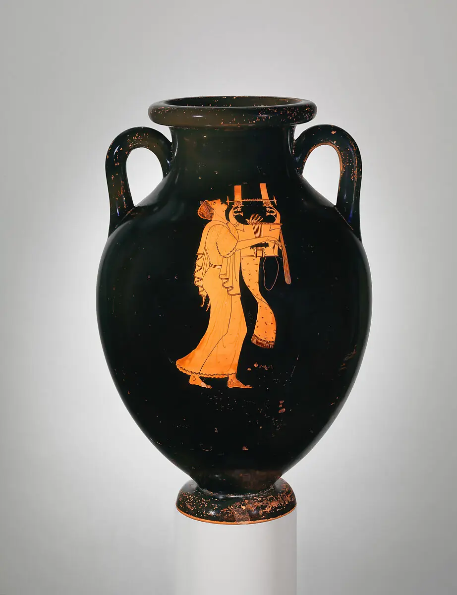
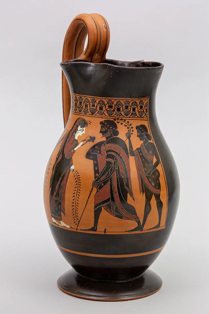
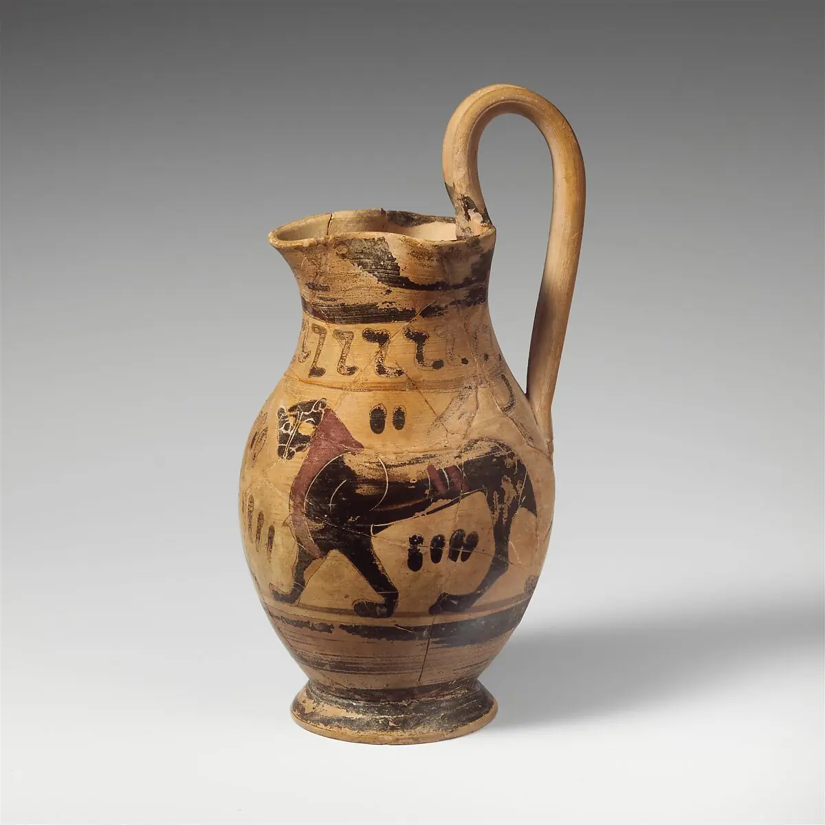
Card deck# Card slides with center snap, mouse drag, click navigation, and visible-slide highlighting.
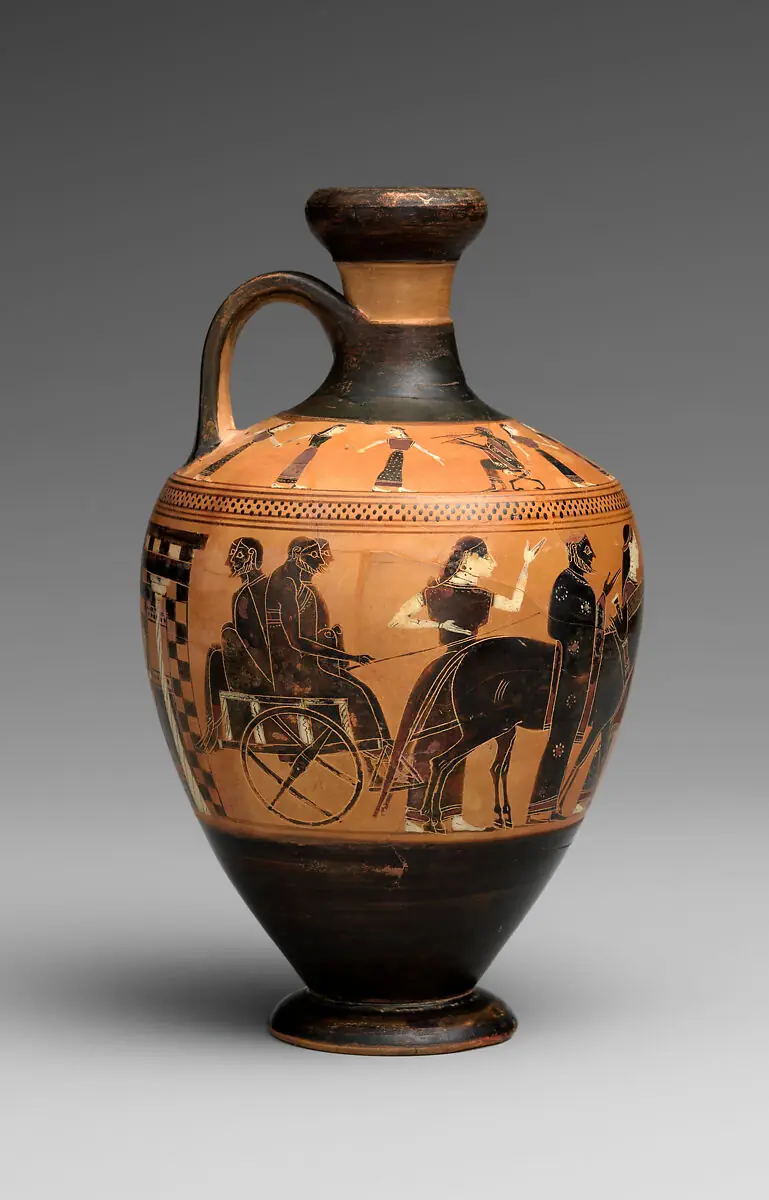
Terracotta lekythos (oil flask) Attributed to the Amasis Painter
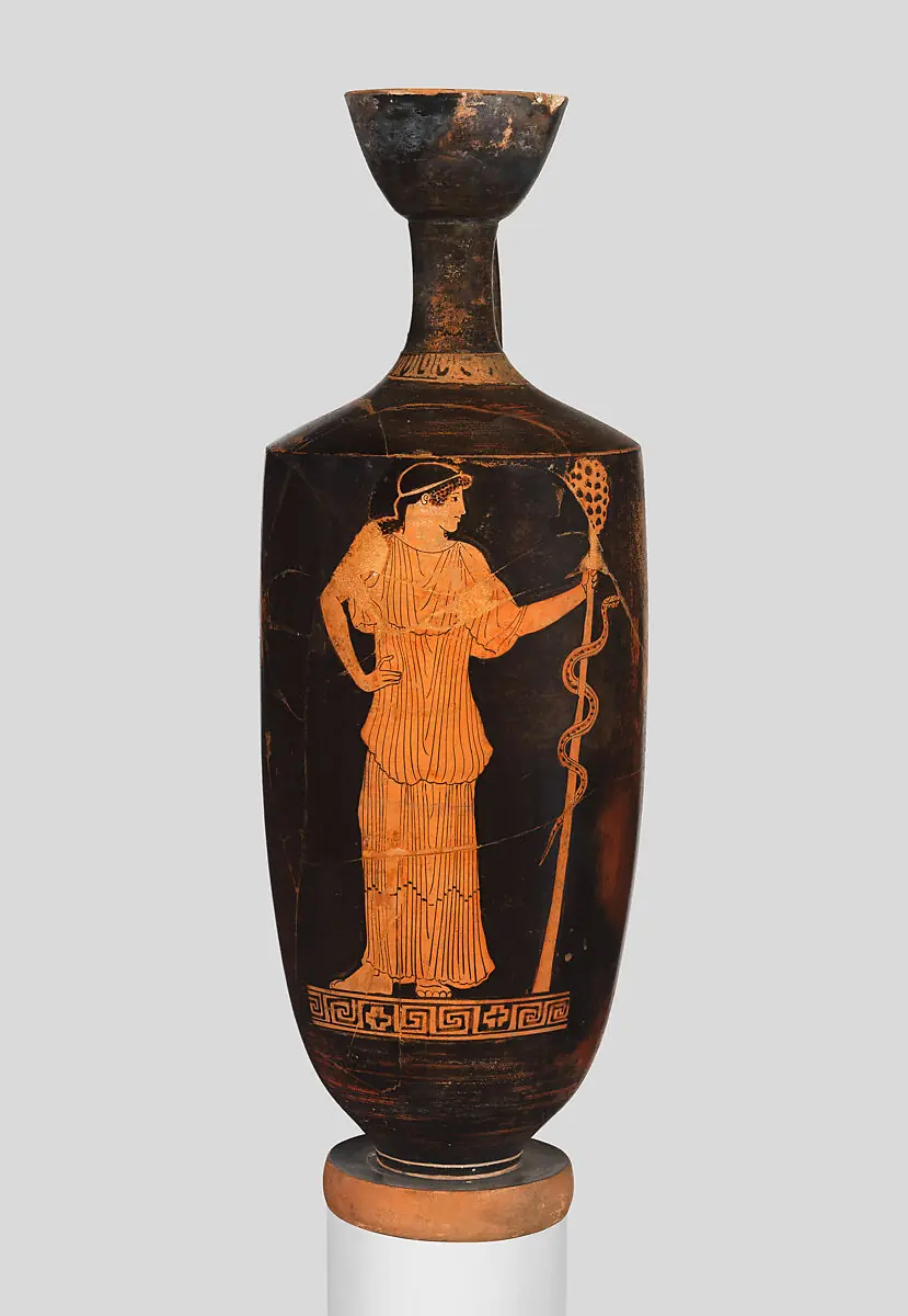
Lekythos (oil flask) Attributed to Hermonax
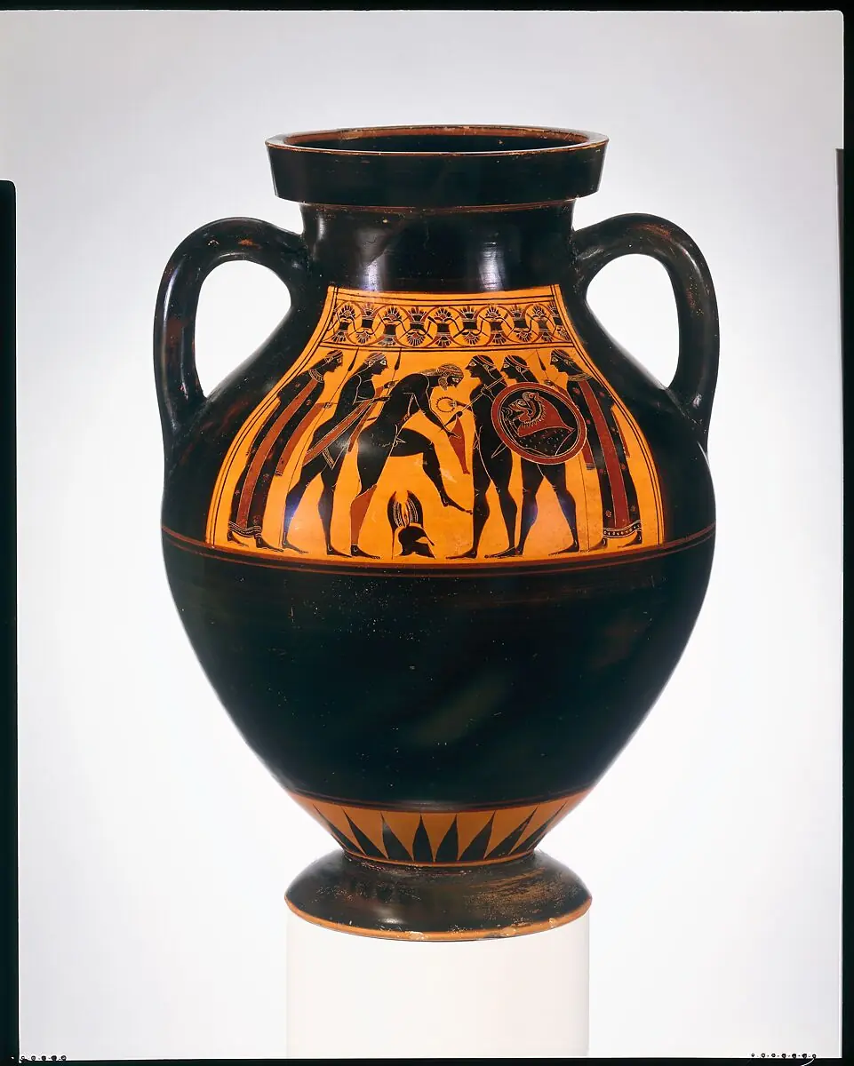
Terracotta amphora (jar) Attributed to the Amasis Painter
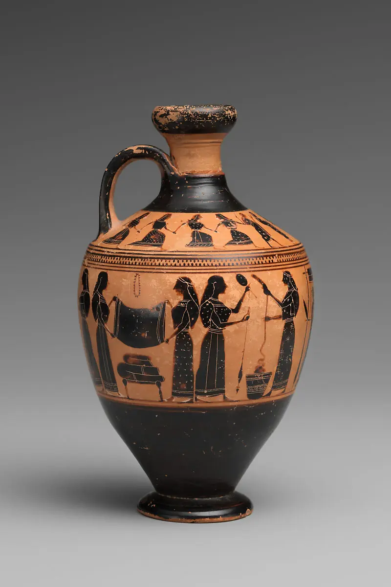
Terracotta lekythos (oil flask) Attributed to the Amasis Painter
Terracotta amphora (jar) Attributed to the Berlin Painter
Terracotta olpe (jug) Attributed to the Amasis Painter
Terracotta oinochoe: olpe (jug) Related to the Group of the Early Olpai
Custom navigation styling# Dots live in the host's shadow root. Reach them from the page via ::part(dots) (the tablist container) and ::part(dot) (each button); the kit also mirrors state into named parts (::part(dot-partial), ::part(dot-full), ::part(dot-current)) so you can style the three visibility states and the active dot. Here a scoped <style> block turns the buttons into bars.
Autoplay + loop# Set autoplay="3000" to advance on a timer. Add loop and an optional pause button.
First Second Third Pause Play
Custom easing# Use easing to customize programmatic scrolls. Durations can also reuse the theme easing.
Vertical# Set orientation="vertical" to get a y-axis carousel. Give the host a height.
No touch# Use touch="false" when gestures should belong to slide content. Buttons and keyboard still work.
100 slides# For large slide sets, skip dots and use buttons, wheel, or touch navigation.
1 2 3 4 5 6 7 8 9 10 11 12 13 14 15 16 17 18 19 20 21 22 23 24 25 26 27 28 29 30 31 32 33 34 35 36 37 38 39 40 41 42 43 44 45 46 47 48 49 50 51 52 53 54 55 56 57 58 59 60 61 62 63 64 65 66 67 68 69 70 71 72 73 74 75 76 77 78 79 80 81 82 83 84 85 86 87 88 89 90 91 92 93 94 95 96 97 98 99 100