This page features interactive demos and side-by-side code samples that need at least 340 pixels of horizontal space. Please widen your browser window, or rotate your device, to continue.
Component <neo-lightbox> is an overlay that expands arbitrary content from one or more triggers. Mark each opener with [data-neo-lightbox-trigger] and the body with [data-neo-lightbox-content]; the host owns the open / close animation, focus, the backdrop, and Esc dismissal. By default it rides the top layer to cover the viewport; contained confines the overlay to the host's own box.
Default
Arbitrary content
Scoped to container
Hover to open
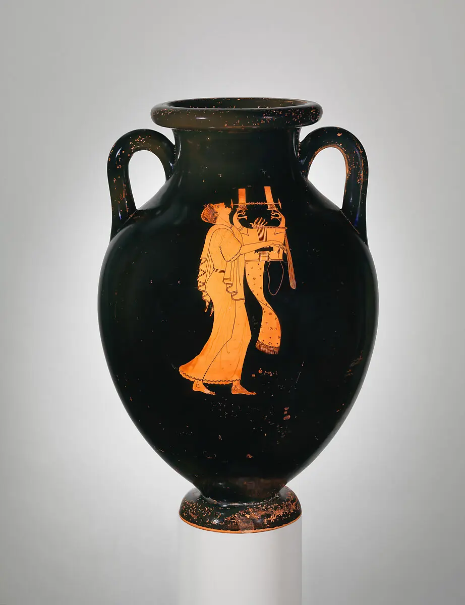
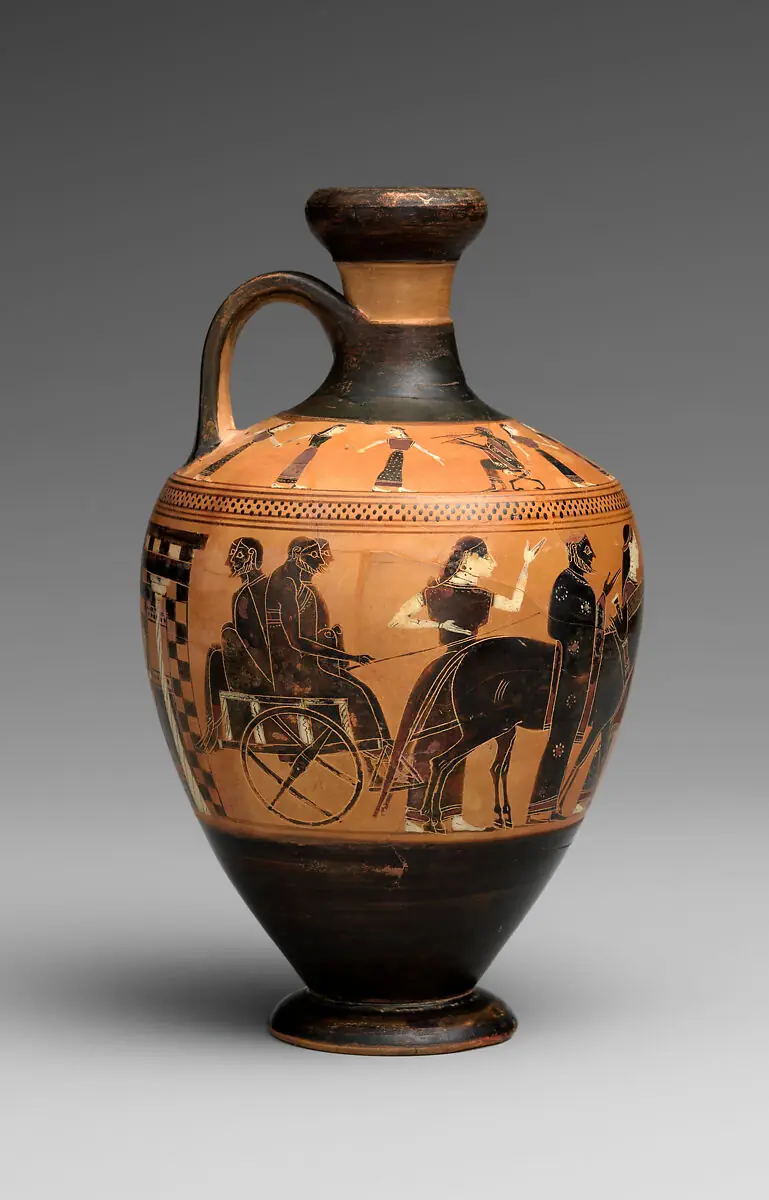
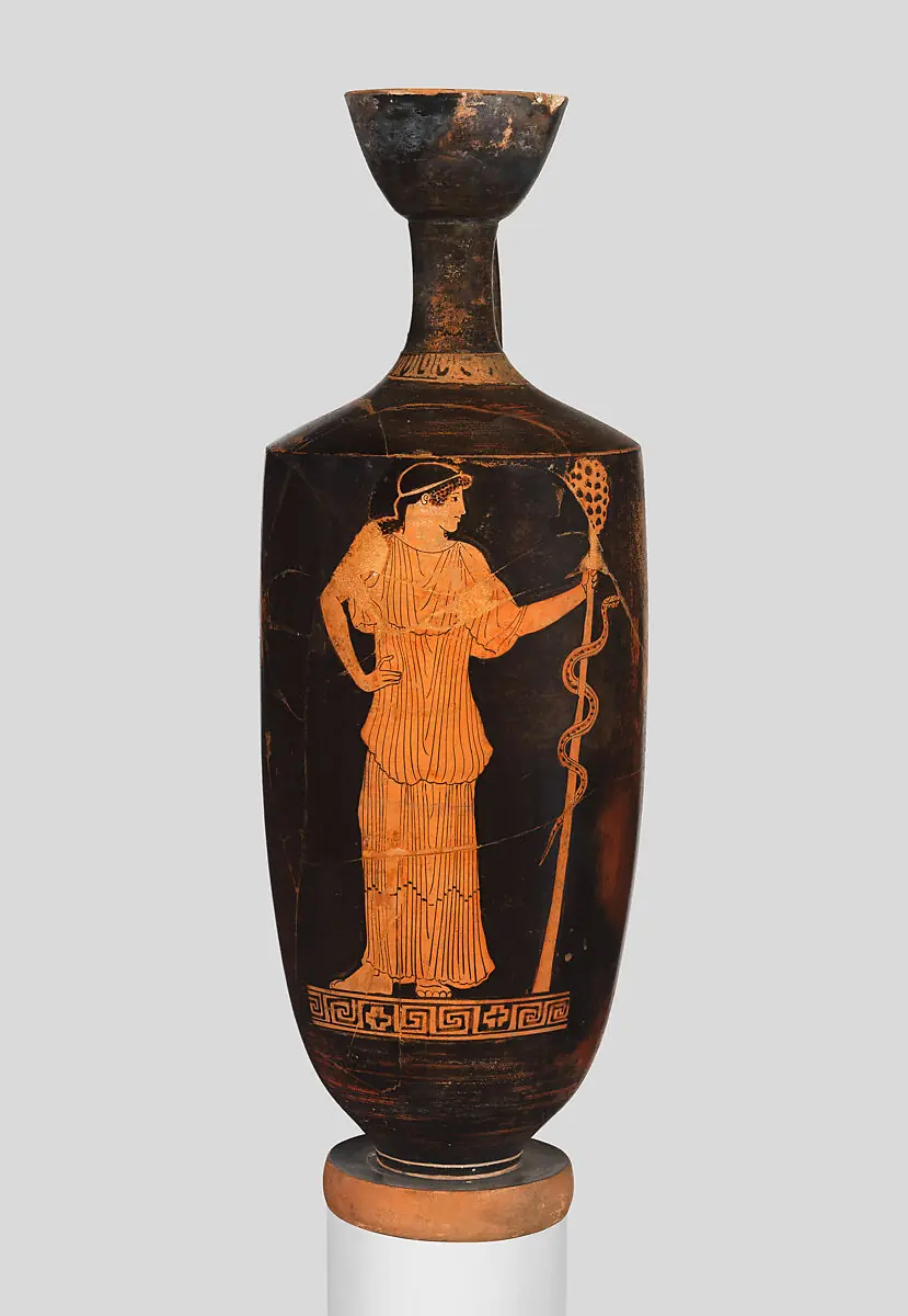
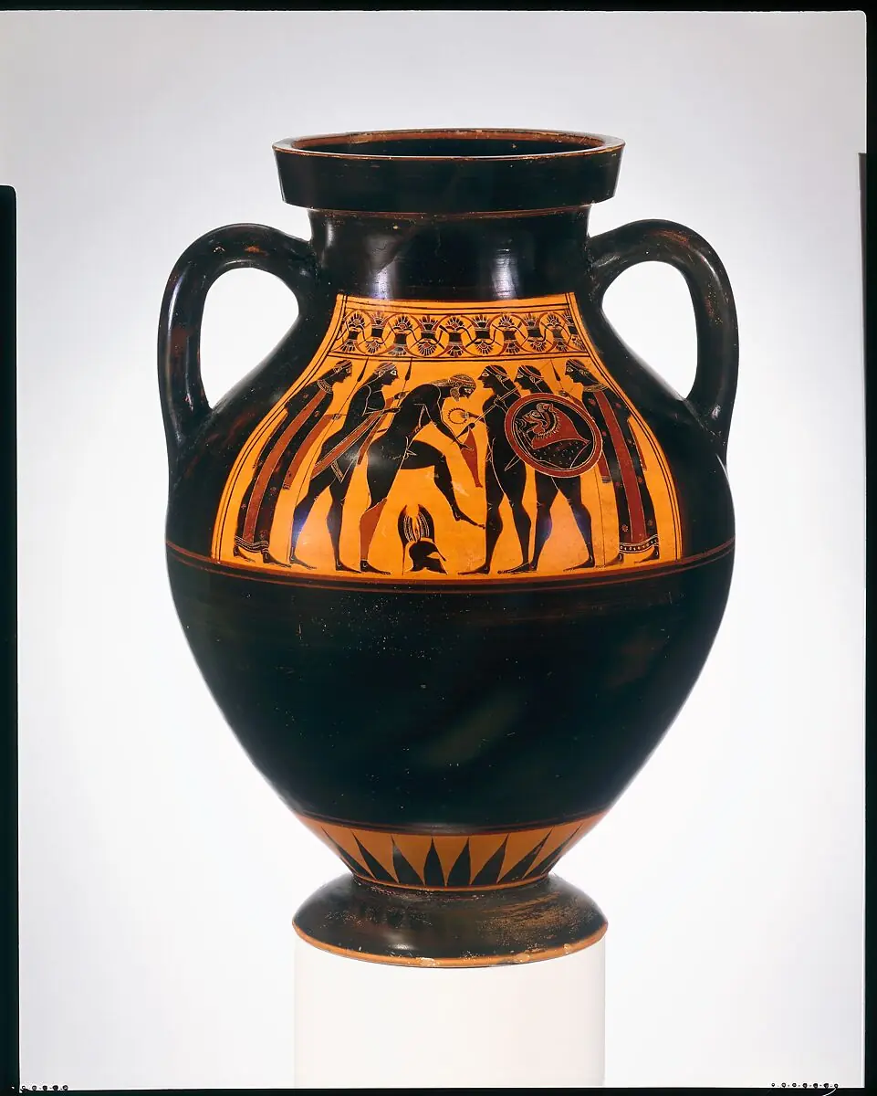
Image gallery
DeactivateRenameDuplicateDelete
The preview routes through the in-browser server simulator. Its current Settings (network latency, a non-200 response, or an unreachable server) are in effect, so the live preview can look like it is misbehaving. Adjust them in the Settings panel.
New state Toggle autoplay
HTMLCSS
The selected state's markup and its scoped CSS. The CSS is wrapped in <style>@scope { ... }</style> and applies to the preview only. Edits change the preview above, applied live while Sync is on, or when you click Patch or Replace. Patch morphs the preview; Replace swaps it outright.
Signals
Datastar signals declared in the selected state's markup. Change a value to drive the preview, applied live while Sync is on, or when you click Patch.
Where the overlay renders. Default promotes it to the top layer covering the viewport; contained confines it to the host's own box, which becomes the positioned containing block.
hover
boolean
false
Open on trigger hover (mouse only). Click still opens, instantly, for touch and keyboard.
hover-open-delay
integer (ms)
100
Delay before a hover opens the overlay.
hover-close-delay
integer (ms)
200
Delay before a hover closes it after the pointer leaves both trigger and surface.
dismissible
boolean observed
true
Set false to disable backdrop-press and Esc dismissal.
transition
"zoom" | "fade" | "none"
"zoom"
Entry / exit style. zoom morphs the surface from the opening trigger's position and size (a FLIP) and back into it on close; fade is a centered scale + opacity; none is instant. The backdrop fades in every mode. Honors reduced motion. Read when the overlay opens, so a change while it is open applies on the next open.
A thumbnail opens its full-size image on the top layer over a dimmed backdrop. By default the image zooms out of the thumbnail and shrinks back into it on close (the transition="zoom" FLIP). Press the backdrop, the close button, or Esc to dismiss.
The content slot takes any HTML, not just images. This one is a panel with a heading, a description list, and its own close button. A [data-neo-lightbox-title] gives the dialog its accessible name.
contained confines the overlay to the host's box instead of the viewport, so the panel covers just this card. The host becomes the positioned containing block.
Morpheus Release Notes
Released June 2026.
View release notes
Release notes
New <neo-lightbox> overlay component.
Carousel deep-linking from gallery thumbnails.
Reduced-motion and forced-colors passes across the kit.
With hover the overlay opens on pointer enter and closes after the pointer leaves both trigger and surface. Click still opens it, instantly, for touch and keyboard. Hover the button to see it.
Every thumbnail opens the same overlay, which holds a <neo-carousel> of the full images. A $gallery_active signal tracks the last thumbnail clicked: each trigger sets it (data-on:click), and the carousel binds to it (data-attr:value) and writes back on navigation, so the photo you click opens first and the signal stays in sync as you swipe.